

Some people buy games because they like the genre or have some strange, unrequited affiliation towards a publisher. Some people buy games because their friends are all buying it, and wouldn’t want to miss out on that all important few days of online play.
And some people – fewer, admittedly – buy games because, just now and again, the men pulling the strings actually give a shit about the user interface.
To me, how a game looks (and I’m not talking about polygon counts or shaders) can be as important as anything else, and whilst that may sound alien to you, know that I appreciate a good menu design or logo much more than trophy count, game length or cutscene frame rate.
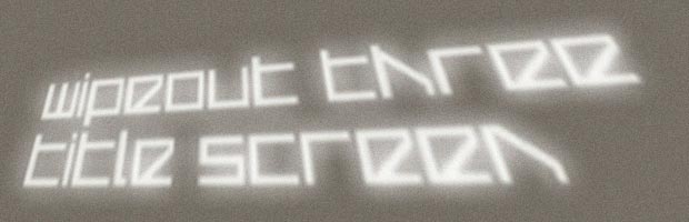
[drop]So when most gamers bought WipEout 3 because it had smart course design, or a thumping licensed soundtrack, I bought it because the title screen simply said wipeout three title screen.On white, in a still fresh looking typeface against deep grey and black, those four words conveyed more about the game to me than any preview could ever attempt to.
In 1999, fresh out of Uni, WipEout 3 was hugely influential on the rest of my working life.
The reason? The Designers Republic, a Sheffield based graphic design studio set up thirteen years prior by one Ian Anderson.
Seeing that title screen swerved my career path, from programmer to designer, in an instant.
I envied the studio and what they were doing as I struggled with an underpowered Mac; was insanely jealous of their consistently against-the-rules output and would have given anything to work there.
“tDR,” as they were known, “is a declaration of independence from what we perceive to be the existing design community” said Anderson. They started on record covers before moving onto games with WipEout in 1995; their rather postmodern outlook back then was skilfully married with Japanese influences (especially Manga) to produce some wonderful artwork.
But while the studio were involved with many games, Psygnosis’ WipEout 3 stands out as being the title that really locked me into the line of work I now follow, and will forever result in an ever critical eye against ever game I play.
This, as you might expect, presents its own set of problems – ones that I can’t easily shake or cast aside no matter what game I’m playing. And my general (and perhaps overly critical) finding is simple, and yet troubling:
[drop2]Rarely do publishers and developers understand good user interface design.It’s not just the visuals, it’s the way users move through the menus and options; a jarring jump to a save screen or a switch around of the buttons are hardly rarities in the industry, the presentation often feeling like an afterthought or farmed out to an intern.
Psygnosis involved tDR from the start, and it shows – throughout the entire game.
Apart from the aforementioned title screen, the same minimal approach flowed into the menus, the team logos, the weapon icons, the loading screens and the in game billboards and livery, all of which were interconnected and consistent.
It made a massive impact – the game was praised for it – and yet for the most part the acclaim that the designers garnered all those years ago is ignored and cast aside as games continue to feature atrocious UI. Not everyone can afford the services of a dedicated agency just for this area, but overlooking it means you may as well just use Comic Sans.
I’m sure I’m in the minority here, at least with respect to how much emphasis I place on what others may perceive to be an inconsequential part of their £40 investment, but I’m certainly not alone.
And on that note, it’s telling that I couldn’t connect with Fusion at all, the PS2 WipEout dropping much of what made the earlier games so special in terms of design.
To me, the work tDR did with WipEout defined the series and showed that games can easily be transformed into something beautiful (or depressingly mundane) away from the purely technological aspects of whatever the publishers are pouring their millions into.
Of course gameplay is king, but a good UI should always rule.

gideon1451
Wow, thanks for linking that article – really interesting!
Crocadillian
YESYESYESYESYESYES
It’s why I can’t stand to play some indie games that apparently have more innovative game concepts. The UI is a key part of continuing the atmosphere of the game and ensuring that isn’t broken in any way. Games like Amped 3 also played on this extremely well to add to the game in the way they playfully used photographic images for various events and the loading screens.
If a game has a poorly designed UI, I usually play it for a bit before it gets put down and is never played again.
shields_t
I was gutted to read that tDR had folded a few years ago. I will always remember them for introducing me to a band I would never have bought into at the time simply because of their album cover design, Pop Will Eat Itself.
Crazyfrog23
Thanks for the great article Alex and to that blog.
I work in a shop with a low customer volume which can make it quite boring at times but I have spent the day reading through the vis-atk blog and a few other blogs mostly about typography and I have enjoyed examining game worlds from a different outlook, so thanks again for posting these links alex, to us the cliche, my eye’s have been opened.