It seems that Sony have forgotten how to design good looking controllers, because after the Destiny 2 DualShock 4, they’ve now announced an equally awful PlayStation F.C. limited edition controller.
They’ve taken a blue controller, slapped some PlayStation symbols on one hand grip as though they were tactics patterns, a PlayStation F.C. crest on the other and embossed some penalty area lines onto the touchpad.

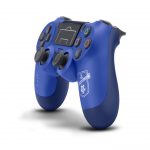
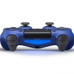

Best of all, while they proclaim that it will be available “across the region” on 29th September – you know, just in time for the football season… which start in August – this excludes the UK, Australia and New Zealand. It looks terrible, and they’ve decided that only mainland Europe are even vaguely likely to buy it.
Meanwhile, over in the land of Xbox, they’re sticking to the classier side of controller design. Sure, some of their colour combos are a bit weird – I’m not sure I like my combat green with orange thumbstick balls controller, but it was cheap – and their Tech series do fall into the “just put some lines and random symbols on it” class of design, but then you also have the gorgeous Shadow series, the most recent of which was announced last week and looks like this:
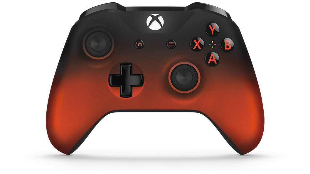
Oh, and you will be able to buy it in the UK as well, which is nice of them.

dave87fez
That’s horrendous. Looks like something only a six year old Everton fan could appreciate. (Just because of the colour and the similarity of the crest to Everton’s badge.)
blast71
Well I’m a 46 year old Everton fan, and it truly is gash. (The controller, not supporting Everton. Well, most of the time anyway ;p)
aerobes
Own goal. Top corner volley, no less.
MrYd
They’re both terrible looking.
Sony probably have the lead due to being a horrible blue and football themed.
But MS look like they ran out of orange halfway through. And that’s ignoring all the things that are wrong with the design of the XBox controller in the first place, but that’s just personal preference I guess. That orange is just wrong though. Scientific fact ;)
Avenger
The shadow controller is nice, as is the white/green combo they’re doing too.
PlayStation just need to stick to doing basic colours. The red, blue, and white versions look just fine. Everytime they’ve done something themed, it looks like a cheap knockoff livery from ebay for 99p.