
As we’ve seen with a lot of video game publishers, every few years they occasionally like to rebrand, shedding old motifs for something a little more contemporary.
Today, Ubisoft has done just that, doing away with the purple-y swirl it introduced way back in 2003. In its stead we have yet another swirl but one that’s a bit more stripped back and can perhaps better adapt between different products.
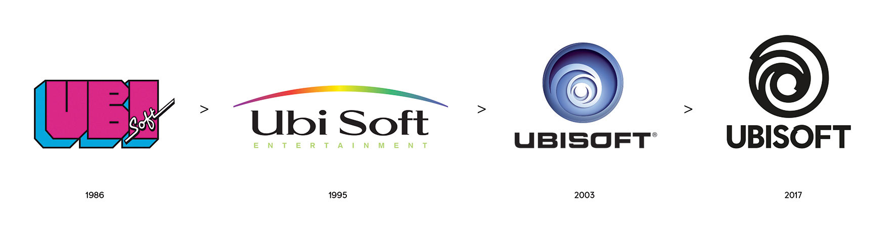
Here’s the artistic spiel Ubisoft gave:
Our new logo is minimalist, modern and monochromatic. It’s a window into our worlds, giving a preview of what’s to come by highlighting the artistry that goes into creating them. The swirl and the letter O are both deliberately created to be reminiscent of hand-drawn shapes and represent our human qualities of enthusiasm, curiosity and the grain de folie that Ubisoft is known for.
Source: Ubisoft Blog


Tuffcub
It looks like someone cant use Adobe. How does not deliberately making the swirl and o not line up properly represent enthusiasm? It represents half arsed-ness to me.
camdaz
I prefer the ‘2003’ logo, even the new font looks crap!
tactical20
86 logo is dope!
MrYd
“The swirl and the letter O are both deliberately created to be reminiscent of hand-drawn shapes”
Or to put it another way…
“One of us has a small child, and we let them do it. The child is a bit rubbish at drawing, like all children, but he’s cheap”
stigdu
Haha! I don;t believe for one second that new logo is real.
The Lone Steven
Wait, that’s the final version? It looks like the template and kinda meh. The blue swirl worked and kinda is iconic(Yes, proper iconic, not Ubisoft iconic) for Ubisoft. THis? This seems like a 5 minute job in paint after someone realised that they were meant to do it ages ago but kept putting it off due to porn research and quickly did it.
JR.
I guess Ubisoft really aren’t bothered if they finish their new logo …or their games.
On a positive note, their work sure is consistent.
Jim Hargreaves
Ouch.