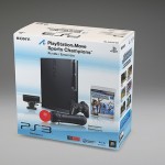
Sony has now officially revealed the final design for the PlayStation Move packaging. Our verdict? Not bad. Not bad at all! Whereas Microsoft has seemingly gone for something bolder, Sony’s packaging is understated but loses nothing for it – and it’s colour coordinated.
Sure, packaging doesn’t have any bearing on how well an electronic device actually works – but as we discussed in the Kinect article, it’s the first thing a consumer who is unaware of the product sees.
It could have used some Kevin Butler though.


Source: US PlayStation Blog
Waldi
The european packs are looking funnier! :D
http://playfront.de/playstation-move-erste-bilder-der-retail-verpackungen/
iAvernus
Looks a little queer to me
Mikiyaru
shouldnt the packaging change colour compared to its surroundings so you can notice it more?
IOMDutch
Nice…But I thought Sony had scrapped the use of the sealed, rip your hand apart, plastic packaging.
bunimomike
I thought they had too but for this device, I can see why they want people to physically see it. It’s still a relative unknown when it comes to the general public. Just a thought/opinion.
Daywalker
Not bothered about the packaging. I’ll get it, take out the gear, chuck the box. Really couldn’t care less if it was pink with pictures of old men on the front.