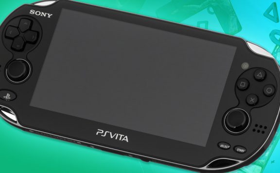
Want to see eleven fancy new screenshots from PS Vita’s operating system, from Gamescom? Course you do, and don’t worry: we got your back.
From left to right, top to bottom, then, we’ve got:
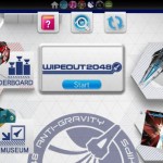
- A LiveArea splash screen for Wipeout
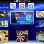
- The PlayStation Store
- Trophy display
- Your User ID and profile
- Messaging
- Near
- Another shot of the PlayStation Store
- Game invites
- A Near pop-up
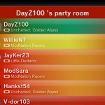
- Party
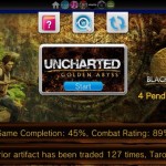
- The splash screen for Uncharted
Yes, they’re colourful, but we can’t help feel that they’re a bit cluttered and noisy, and perhaps too colourful. Certainly, they’re lacking the sterile beauty of the XMB, and heading more towards the way the 3DS has entirely different layouts for each screen.
We’ll see how this pans out…


Via JustPushStart.

Jim H [Teabags]
Liking the idea of the gift/trade system that the Vita will use. Apparently players will earn in-game items and when out and about we can drop these items in real-life locations for other players to receive. Might not be entirely accurate but that’s how the Sony Develop keynote put it.
simplebob
If I had to navigate via analogue sticks/arrows then yes this would feel cluttered, but the fact that its touch screen will mean having all those options should mean its pretty easy to navigate to everything related to a game – the more I see the more I want one – starting to get excited now. Just want to hear news on a meaty RPG for the system and I’m sold.
KeRaSh
Good point. I was looking at it with stick controls in mind. However, I still like a more minimalistic OS approach. This reminds me of the 360 Dashboard OS, which does not appeal to me at all.
Crocadillian
I think although some areas are too bright and don’t have enough detail to break it up (such as the friend page), the console just reminds me more and more of the Dreamcast, which is kind of weird, but awesome.
deepmenace
haha….ha…..the, err, second one is a joke right? or beta or something yeah?…..guys?
Jambo
That’s just an advertising splash screen before you enter the store.
AG2297
That AG museum in the first screenshot sounds interesting.
nofi
Yeah, per game splash screens look ace. Apart from the ugly blue Start button.
bunimomike
It was a place of worship for all things AG(2297). *prays a while and sees the face of AG on a toasted crumpet*
GTRsannin
I think it looks good
colmshan1990
I like it.
The XMB has gotten a bit boring, and would be horrible to use with a touchscreen.
I especially love the splash screens for the games.
TRiLoGY
Argh, my Eyes!! lol..
Its a bit cluttered and messy, but I kind of like it!
enroene
Colour me impressed.I have to say this is more than I expected so to Sony Great Job.you’ve done me proud.Now if only you could sen me one piece of this kit I will be your best freind. Impressive.
Jambo
Layout seems fine for me, the colours will be adjustable like the XMB so not too worried about that.