Want to see eleven fancy new screenshots from PS Vita’s operating system, from Gamescom? Course you do, and don’t worry: we got your back.
From left to right, top to bottom, then, we’ve got:
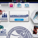
- A LiveArea splash screen for Wipeout
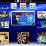
- The PlayStation Store
- Trophy display
- Your User ID and profile
- Messaging
- Near
- Another shot of the PlayStation Store
- Game invites
- A Near pop-up
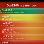
- Party
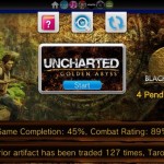
- The splash screen for Uncharted
Yes, they’re colourful, but we can’t help feel that they’re a bit cluttered and noisy, and perhaps too colourful. Certainly, they’re lacking the sterile beauty of the XMB, and heading more towards the way the 3DS has entirely different layouts for each screen.
We’ll see how this pans out…


Via JustPushStart.

skibadee
looks great to me nice change from the bland.
Tanzil
can’t wait to buy this and see all my productivity go out the window!
gideon1451
Mm, I prefer the continuity of the XMB personally.
aerobes
Far too busy, I don’t like it at all. These are just pictures however and it might be a lot more appealing (and customisable) when it’s in the palm.
iBirch
I like the look of it, very impressed so far. The Vita is ticking all my boxes atm.
Steve
Too bad I didn’t get a chance to take a look at the ui yesterday. Then again, playing Uncharted on it convinced me I need to buy a Vita whenever possible!
Smallville2106
Just as long as the games are good and support keeps coming then I am not that bothered how this looks.
gazo69
Does this just allow you to have your current PS3 profile on or will you have to have a separate one?
Kaminari
Another bloated OS from Sony.
And they want us to believe that there’s no room left for cross-game chat on the XMB…
Kennykazey
Quite colourful, yep. But that might have to do with the theme used. The menus seem to be built for touch-control, so I guess they’re good. Certainly not a deal-breaker.