
Let’s be honest, the announcement of Tony Hawk’s Pro Skater 5 could have gone a lot better. So far what we’ve seen of the game hasn’t filled fans of the series with a ton of hope, with the released footage looking dated before release. Now some new screenshots have landed and it appears that to cover some of the issues cel shaded graphics have been put in.
I’ll let you be the judge.


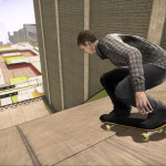
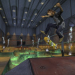
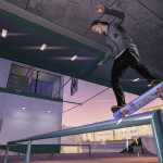

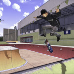
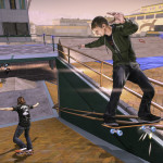

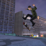


Source: The Ride Channel
tactical20
Still looks utterly terrible. Just look at the front truck in the first image, lol! Level designs look boring and lazy. Nice hair in image 11 too! Absolute shite.
Kennykazey
That doesn’t look like real cel shading, more like they’ve added outlines and flattened the lighting.
It doesn’t look too hot if I’m honest.
Geffdof23
I must be looking at a different game to everyone else. I thought the previous screenshots and trailers looked fine and these look even better. Sure it’s not hyper realistic Unreal Engine stuff, but it’s not supposed to be.
I like the colour pallet, the sharp lines and the depth of field effects.
I’m also more interested in the gameplay then anything. As long as it plays like the first few games in the series, which I’m assuming it will given that is has the THPS 5 name, then I’m interested.
And is that last screenshot of the pool from School II? I hope so.
Wozman23
Geffdof23, I’ve been trying to reach you for years. This is your eye doctor. You are way past due for a routine eye exam.
scavenga
LOLol :D
Geffdof23
Well that’s a bit harsh.
Pixel_nme
Guess I might have to book an appointment as I agree with Geffdof,I thought it looked alright for a tony game before and I kinda like this look also.
Forrest_01
I too am in this camp – Not that I think that this will be pushing the graphical prowess of the PS4, just rather that I don’t really care if it isn’t as long as it plays right.
These screenshots do look a little better than ones seen previously though.
scavenga
I do think the new screens are a tiny bit more appealing than the first ones, but it doesn’t affect my reservations towards buying it.
Until they add local multi, I’m out.
Tuffcub
Well it looks better than it did.
Jim Hargreaves
Not looking as good as I had originally wanted but hopefully the gameplay is still fun.
carson321
I much prefer the cel shading in the game XIII, and that was on the PS2!