

Ubisoft’s recent re-branding his been met with rapturous applause and plaudits from near and far, their ground breaking idea of getting a six year old to create a black and white version of their old logo in MS Paint has been hailed as an unbridled success.

“The swirl and the letter ‘O’ are both deliberately created to be reminiscent of hand-drawn shapes,” said Ubisoft, “they represent our human qualities of enthusiasm, curiosity and the grain de folie that Ubisoft is known for.”
With that in mind we reached out to the same consultancy team that worked with Ubisoft, headed by Belgium extrovert, Pierre le Poisson, and asked them to work their magic on some other famous logos, and explain how they have been improved.

“The current Activision logo is just spiky, it just screams ‘I am unfriendly and will steal your pesto!'” Pierre tells us. “For this completely new version I have softened the edges and distressed the letter O, which, as you can tell represents the need for all humans to be loved. The additional swipes represent dynamic inter-hyper-tree thinking and esports.”

“Oh Sega, your old logo was so complicated!” extols Pierre. “I have simplified the design, creating tension but also a sense of longing for cherry tree blossoms blowing on a spring breeze. By slicing through the top half of the ‘A’, my team and I have clearly communicated cloud based networking communities, tactical RPG character progression, and icicles.”
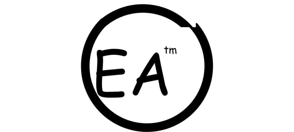
“It was hard to improve on such a masterpiece,” admits Pierre when we quizzed him about the redesigned logo for Electronic Arts. “However, I dug deep into my soul and cuddled puppies for four days to energise my chakras and, finally, was inspired by the simple beauty of the Comic Sans font. That might have been enough for lesser creative beings, but I have gone one step further and added a soul enhancing jus to the circle, demonstrating – with great finesse, I must say – the four stages of man.”

“Microsoft’s Xbox was particularly difficult to rebrand as their console numbering is erratic, but progressive in a modernist structural archetype,” admits Pierre. “I have taken inspiration from the snow fields of Chechnya for the background of their new logo which is a simple, yet conveys an immense feeling of infinite possibilities. The featured iconography is slightly off centre in the design, and I’m sure you don’t need telling what that represents!”

Redesigning the iconic PlayStation logo, Pierre explained that “The logo has be turned to show forward thinking, with a clean white swoosh breaking through the new lettering (which is in Impact for impact), clearly tells consumers that Sony is breaking new ground in the high energy FPS/RPG/MMO market.”

Finally, as a little extra, we couldn’t let Pierre go without asking him to tackle our very own logo, and he didn’t hold back when he saw our current design. “Ugh! It is horrid!” exclaimed Pierre. “Why have you cut out a chunk from the hexagon and moved it a little way to the side? Who would even do such a thing? I mean, why? What does it represent?!”
“I have fixed your terrible logo by re-integrating that ridiculous chunk of hexagon that was floating off, thus restore the key karma points and elevating the mythological ideals that were hidden in plain sight.”


bunimomike
I don’t know whether to cry or just ask for you to be locked up. :D
Stefan L
Tears of joy, right?
tactical20
?
TSBonyman
A fascinating insight into the thinking and processes involved in updating company logos! ;)
freezebug2
Stunning article, still laughing.
TC on top form ;)
ron_mcphatty
That Ubi logo is a mess and deserves and round pisstaking. Very good TC :)
stigdu
I genuinely LOL’d at the EA logo. :)
Andy Torr
Am I missing something here? The new UBI logo is lovely. I actually thought their old logo was ugly as hell.