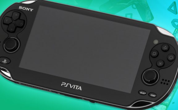
The PlayStation Vita has a native screen resolution of 960 pixels by 544 pixels. It displays those at a density of 220 pixels per inch. It’s a bright, vivid and well contrasted OLED display that is capable of looking astoundingly good, with the right content displayed on it. A shame, then, that so many of the platform’s big hitters don’t run at that resolution. Everybody’s Golf, Uncharted: Golden Abyss, ModNation Racers… the list goes on. And on.
The latest big name Vita title to run at a lower resolution than the menu screen is Resistance: Burning Skies, at least in our review code. Before everyone gets defensive about their beloved portable gaming device, let me say that I can live with a little image stretching if the gameplay is solid underneath. It’s not ideal, certainly, but I’ve played some ugly games in my time simply because I liked the way they played.
[drop]The issue here isn’t what I personally like, and don’t be arrogant enough to assume the issue is what you personally like, either. It’s about what is the best possible situation for us all. What is best for the machine, its owners and, perhaps most importantly at this point, its potential owners.Don’t let your love for that glossy black slab of tech cloud your judgement, games running below native resolution are less attractive in many ways than those that fill the full native pixel count. Stretching the image increases the “jaggies” that aren’t particularly well handled by the Vita’s anti-aliasing. It also gives the image a slightly blurred appearance that washes it out and robs it of some of the colour that the Vita’s luscious screen is so adept at displaying.
Top quality gameplay will lead us to forgive that, of course, but visuals are often the first thing prospective owners notice so hoping, asking, expecting better is wanting more people to be struck by what a great machine the Vita is. So, it’s something we can live with, but it’s definitely not ideal for a device that isn’t appealing to as broad an audience as it could be.
I would like to suggest that the Vita’s graphical prowess might have been overstated before its release. That famous, and completely erroneous, statement that the Vita is like a PS3 in your pocket raised our expectation levels to unreasonable heights. When my imported console arrived at the end of December, complete with Uncharted: Golden Abyss to play on it (it ended up costing me over £700, by the way – before anyone else suggests that I might “want Vita to fail”) I was eager to see how outstanding the visuals would be but I found myself feeling quite disappointed. I’d been hanging on to the impossible dream of PS3 quality visuals in my pocket and it wasn’t. It isn’t. It’s very impressive, for a portable device, but because I’d been told to expect more, I was disappointed.
The same mistake continues to be made. I’ve spotted a couple of outlets pretending that the “screenshots” of Resistance: Burning Skies that Sony sent around yesterday are really screenshots of the game on Vita. They’re not. They were sent through at a resolution 400 per cent larger than the Vita’s native resolution pixel count. They’re renders, probably pulled off the development machine (and stripped of any HUD elements, too) to show off what they’ve made, not what the Vita runs. This isn’t uncommon. For various reasons, certain outlets require larger images – decent quality print, for example – but usually the disparity in resolution isn’t so great.
[drop2]The review code for Resistance: Burning Skies won’t let the Vita’s standard screenshot function (pressing PS and START together) snap an image so we can’t show how it really looks but it does not look like those images. In short, Burning Skies is almost certainly not, as OPM.co.uk and others suggested, the “best looking game on Vita right now”.It looks fine, don’t worry about that. It’s perfectly fine. Quite good, even. Previews and trailers have told us that. What it doesn’t look like, is those images. OPM has the same review code that we do, I’m sure. So they know what it looks like. Even if they didn’t, as I didn’t when I posted the same images yesterday afternoon (I hadn’t loaded up the game yet), it’s fairly obvious from the size of the images and the lack of a HUD.
The cheeky question mark at the end of their hit-grabbing headline indicates that they know it’s a dumb question to begin with. At best this is a little bit disingenuous. At worst, it’s deliberately misleading and has the potential to part users from their hard earned cash for something which doesn’t look as they expected. I have ethical concerns over that but perhaps I’m just more sensitive than the guys writing for OPM.co.uk. Not that the post containing those screens is home to any writing – it’s just the full resolution images on a single page per image (pageviews are a valuable commodity for a website).
I have absolutely no issues with the – let’s call it “attention grabbing” – headline. I have no issue with the multiple pagination to grab a few more pageviews from each visitor. That’s the business and it’s probably why they’re better at it than we are. I am a little uncomfortable with the appearance that OPM.co.uk seems to be partaking in a kind of pretence about the images. Without explaining to visitors that these are not screens taken from a game that runs like that on a Vita, posting them under that headline is misleading. Isn’t it?
Maybe it doesn’t matter, and as I said, OPM.co.uk are certainly not the only people to do it. But I can’t help thinking that the first thought you have when you load the new Resistance game up for the first time should probably be something other than “oh, it doesn’t look as nice as I thought it would.” Especially when the way it does look is perfectly acceptable.

Tuffcub
OPM are terrible with their hit baiting headlines.
I noticed that they have the “World Wide Exclusive” on Black Ops 2 as well. Well, exlcusive to them and a couple of other magazines.
nofi
I don’t want this to turn into an OPM slagging match, but this – http://www.officialplaystationmagazine.co.uk/2012/05/23/playstation-network-offline-4pm-thursday-to-8am-friday-this-week/ – is terrible. The PSN is NOT offline tonight.
OPM is, by definition, an ‘official’ outlet for PlayStation. It’s heavily in bed with the EU Blog (and vice versa) so really should ensure the truth is reported.
But, no.
Tuffcub
Not forgetting this http://www.thesixthaxis.com/2010/11/02/opsms-black-ops-verdict/
bmg_123
Why the hell does Sony still use them, it doesn’t help their PR to spew out falsified stories from an ‘official’ source.
JohnnyBoy
Exactly – I used to subscribe to OPM and thought it was a pretty decent publication. Most of the reviews were spot on and it had some really interesting feature articles. But in the last year or so it’s gone down the pan. Headline grabbing, so called exclusives and the final nail in the coffin for me was publishing reviews online before they’d gone into print – I used to eagerly await the new edition dropping onto my doormat to see the latest reviews.
This is a sign that print really has no long term future for gaming.
shields_t
Aren’t they effectively just Playstation Pravda though?
JoshHood
Well put. I don’t have any problem with the sub-res stuff (even if ModNation looks a little iffier than I’d like), it’s that sort of rubbish headline that bugs me.
bigbaldwolf
You can tell Modnation is running below the Vitas native resolution but that hasn’t stopped me from having hours of fun with it. People are just too into looks these days
stueeeee
If it was running at full capacity like Wipeout it’d look awesome!
JoshHood
Oh yeah, I’m loving the game, but especially the first few races, I picked up on it :)
bigbaldwolf
A good response to the images that were sent out. It’s almost as if the devs are ashamed of the actual quality of the game so they need to send out these obviously rendered images. I for one can take a few pixels and jaggies so just show me how the game looks and let me judge it for myself.
Kennykazey
I don’t mind sub ps3 graphics either, but I never expected the vita to match the ps3. I’m still impressed with how good DS games look, but that might be because the last handheld console I owned was a Game Boy Pocket…
I do, however, prefer native res over fidelity. But I bought and played Everybodies Golf yesterday and did not notice the lower resolution, which I did in Uncharted.
Paranoimia
Golden Abyss was the same, and it looks fantastic. I’m not interested in this game (lost interest in Resistance after 2), but generally speaking, not being native resolution doesn’t bother me in the slightest, as long as it looks good. There are plenty of PS3 and 360 games that aren’t native HD resolutions either.
I don’t think it’s an issue which will bother most people. The more hardcore early adopters certainly don’t, and as for the rest, I doubt they’d know anyway unless they read articles like this.
Basically, it’s like those “PS3 v 360” videos that CVG keep posting – utterly irrelevant; you’re not likely to be running both versions side-by-side, and when you look at them separately, you’re very hard pressed to tell the difference anyway.
Okay, so OPM used the render screens and didn’t mention it – just like every other mag and site, then. I don’t think it’s ‘sneaky’ of them at all. They actually ran an article some time ago explaining that very few screenshots are actually from the games anyway, some even containing views/scenes that you literally cannot get in games, because they’re renders pulled from high-end PCs with movable cameras giving angles you cant get in the game, to add a dramatic feel.
Taylor Made
The best looking game on the vita is wipeout hands down. UCGA was a pretty game but you could see the flaws in the graphics I mean escape plan looks prettier than most big titles. Mortal kombat also is another example nice game but as soon as you start playing you can see the graphics ain’t on point.
But if the game plays nice you hardly notices those flaws in the graphics
Tuffcub
Mortal Kombat is odd, for some reason the skin tones of the fighters are much lighter than they are in the cut scenes. Not sure why.
PoorPaddy89
Wipeout is pretty gorgeous. I’ve been considering MK as I haven’t played one before, but there seems to be a lot of hate for the graphics on some other sites. And when it comes to trying a new game series, I’m pretty shallow :P
GeneralJeeb
Agreed on Wipeout, it’s absolutely beautiful. Have to say though, I tried my brother’s copy of MK on vita and while the graphics really threw me at first (god only knows how many hours I’ve put into it on PS3!) the gameplay is rock solid. I have to say, I’m kind of regretting buying UMvC3 now that I realise how good the vita version of MK is, marvel’s beautiful but WHERE’S THE CONTENT? sad face. the end :)
Sympo
UmvsC3 is great but for that its mainly a online game or a game to play with friends.
Single-player is great though but sadly a bit lacking. I wonder why they don’t include Survival mode.
Sympo
The skin is really bad… if only it was a bit better because to me its a bit of a eyesore too look at.
Tomhlord
umm…. there is a question mark…..
teflon
Yeah, but that question mark simply puts it on the same level as saying “Is this man guilty of murder?” and then showing a bunch of falsified evidence to a Jury.
It asks the question and then leaves it to the viewer to decide for themselves on the back of something that isn’t fully representative of the actual thing. That it’s even asked this question immediately gets the suggestion into ones head, like a poor man’s Inception.
Tomhlord
?
PoorPaddy89
I thought Golden Abyss was rather pretty apart from really bad anti-aliasing, or being low res as this article says. Whichever. To be honest I wasn’t really expecting much better, especially at launch.
I enjoyed this article, but it does seem to be written as a reply to Vita fanboys. Has there been much fanboyism then? Only I haven’t really noticed any.
teflon
They should have mandated native resolution. I know it’s hard to get the best out of machines on day 1, but it’s something that really does detract from the experience. On home consoles you’ve got such a variety of screen resolutions and sizes to cater for that it’s not as big a deal, but with a single screen size and type, it’s not right for the Vita.
borg117
To be honest, uncharted’s resolution never bothered me, i was astounded at the sharpness of textures and clarity of colour. the only aspect that was hindered was when you kept the camera still and looked hard enough at the screen, especially in the first few levels because there was pixelation. But so much was done it was a fantastic game.
With the whole resistance thing it’s terrible (the images) and yet again another sign of marketing tout. i would ask anyone is it worst than uncharted? modnation was an disaster graphically, all the commotion from san diego they don’t even put full res menus.
I’m starting to question whether sony was too ambitious in incorporating a widescreen SD standard res in a handheld with handheld scale specs. Then again, games do get better, look at PS3 games (uncharted ones too).
borg117
By the way, I do love my vita, great games, great system. If uncharted is good graphically, surely future games can be too.
Burgess_101
I had to send back my Vita yesterday analogue sticks weren’t working correctly. The games looked fantastic on it. Especially Uncharted. Really strange how even first party titles don’t adopt the native resolution.