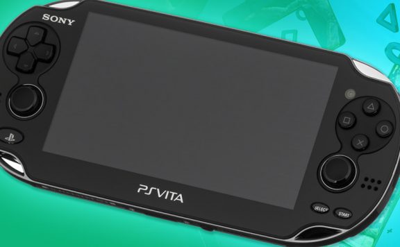
Sony has just unveiled the final box design for the PlayStation Vita. It’s a swirly blue design with a nice big image of the powerful little handheld front and centre. Nice to see them using the “PlayStation blue” and nice to see quite a simple box design.
It would seem, judging by the shape of the box, that they’re not going to try to emulate Apple’s recent packaging trend of putting everything in a tiny box with very little superfluous packaging. Or perhaps it just comes with so much stuff that they needed to make a square box in order to fit it all in?
The PS blog also has the icon designs for the system apps. These are very disappointing, in my opinion. They seem to be very dated and clumsily designed to me, although I expect Sony has had them through several stages of design and approval so I expect there are many out there who love the bulbous, circular approach.
What do you think of the packaging and icons?


Source: PS EU Blog

Kevatron400
Dear me I’m not keen on those icons at all. Hopefully it’ll have themes like the PS3 whereby the icons change to match the theme.
teflon
Seriously ugly logos. Should’ve stuck with the better human interface design from the XMB. It’s easier to distinguish the outline of objects rather than pick from a bunch of identical shapes with rough symbols included.
Anyway, even if all the silly circles were a good idea, these things are completely ugly.
Jaffa-the-Cake
They look like the icons on the Wii menu. That ISN’T good.
Klart
Ditto. Don’t like the icons. Way too Wii.
Hopefully this is customisable.
PoorPaddy89
I wouldn’t be surprised if we can make our own themes, just like the PSP and PS3. Hopefully they’ll keep the toolkit more up to date than the others though.
Jakster123x
Hate to be in the minority, but I like bubbles, especially ones with trophies in them.
TSBonyman
Nice box, horrible icons but i guess as long as they give a clear indication of their function they’ll do. Perhaps it’ll be possible to replace them with user-created themes?
scavenga
The design of the bubble interface and icons is very, very poor and offputting.
Bilbo_bobbins
looks like a toy for a 5 year old. Sort it out Sony
gaffers101
I like the box – the bit we through away!!
I don’t really like the icons though, but then I didn’t like the name Vita either when it was first announced!! I’m sure we’ll get used to them.
gaffers101
‘throw’ doh!
Foxhound_Solid
Cool box, ify icons to be fair. Day one :-)
CrawFail
Don’t see any problem with the icons… are you guys seeing something I’m not?
Andy Torr
They’re very very poor quality. It’s the awful white shadows on the inside of the bubbles that make them look like some cheap Photoshop. They look incredibly amateur.
Andy Torr
Photoshop job*
CrawFail
Hello stranger!
They could be worse.. Like just circles with their function written inside them.
It’s probably coz I’m not graphically orientated but they look alright to me.
Oh well
Kennykazey
Don’t really care what the box looks like, but it’s nice.
The icons look too childish.
kjkg
The bottom left icon makes make think of Ape Escape. Is that a bad thing?
tom_lord
It’s not the design of the logos that matters, it’s what they represent that’s far more relevant……
Andy Torr
Not really. Design is everything these days.