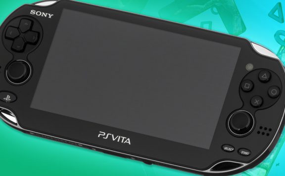
Sony has just unveiled the final box design for the PlayStation Vita. It’s a swirly blue design with a nice big image of the powerful little handheld front and centre. Nice to see them using the “PlayStation blue” and nice to see quite a simple box design.
It would seem, judging by the shape of the box, that they’re not going to try to emulate Apple’s recent packaging trend of putting everything in a tiny box with very little superfluous packaging. Or perhaps it just comes with so much stuff that they needed to make a square box in order to fit it all in?
The PS blog also has the icon designs for the system apps. These are very disappointing, in my opinion. They seem to be very dated and clumsily designed to me, although I expect Sony has had them through several stages of design and approval so I expect there are many out there who love the bulbous, circular approach.
What do you think of the packaging and icons?


Source: PS EU Blog

enroene
Ugly icons and it is weird when guys leave good things to move to worse/uglier things.Sony you can surely do better than those or at least make them customisable.
Cray2k
I do quite like the way there is a list of the previous PlayStation consoles in order of release and how it’s designed to look like a track listing. I thought that was quite clever
Cray2k
On the Music icon
billsmugs
I hadn’t noticed that! I think the music icon is the best of them all, seems like they put the most time into it.
sparkyscrum
I like the box, hate the icons. Roll on themes please.
MXZ
I do not like the look of that box.
to me, it looks like a mobile phone box instead of a game console.
the colours seem very dull and the only thing of interest would be the device, which in turn seems like a powerful thing……for checking your stocks.
it jut doesn’t scream HD GAME PLAYER, as much as it shouts THIS DEVICE MAY BE SUPER POWERFUL BUT I DOUBT YOU KNOW WHY.
right now im thinking of putting this on my bedside table and imagining how it will blend with everything else in there and it would easily be the least impressive box in my possession.
that being said, im not too fussed about the finalized icons.
sure their basic but their different and that all i need (besides, i just cant picture the XMB on the Vita)