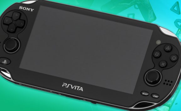
Sony has just unveiled the final box design for the PlayStation Vita. It’s a swirly blue design with a nice big image of the powerful little handheld front and centre. Nice to see them using the “PlayStation blue” and nice to see quite a simple box design.
It would seem, judging by the shape of the box, that they’re not going to try to emulate Apple’s recent packaging trend of putting everything in a tiny box with very little superfluous packaging. Or perhaps it just comes with so much stuff that they needed to make a square box in order to fit it all in?
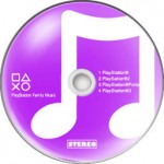
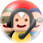
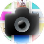
The PS blog also has the icon designs for the system apps. These are very disappointing, in my opinion. They seem to be very dated and clumsily designed to me, although I expect Sony has had them through several stages of design and approval so I expect there are many out there who love the bulbous, circular approach.
What do you think of the packaging and icons?


Source: PS EU Blog
gazzagb
Cool box, nice icons too.
nofi
Icons are ridiculously bad.
SpikeyMikey23
Those icons look pretty pants, like someone just knocked them up in photoshop. (not that I could do any better mind you)
Sympozium
Its ok, hope theres custom themes…
BrendanCalls
Those logos are bad, whats with such a bold, immature fonts. it all seems rather childish to me
Surely you’ll be able to change them though, so long term its not that much of issue I guess
KeRaSh
Box yay, icons nay…
moshi
I love me some Box News.
Peter Rushton
Love the box!!! :D It’s so simple yet playstation, good use of the brand name imo & the colour scheme is fab!
Rocket_345
Don’t like those icons. Themes will be brought out eventually though so there may be a few icon changes in those hopefully. Not getting this day one due to lack of funds so this will be Crimbo next year so by then there will be a decent catalogue of games that i want out (same thing iu’m doing with the 3DS) and there will be cheaper memory sticks out there.
Gadbury
Icons awful. Even though they are all pastel shades and bubbly, they look inconsistent and some too fussy.
I actually think I could make something better in MS Paint, and I’m not a graphic designer or kidding.