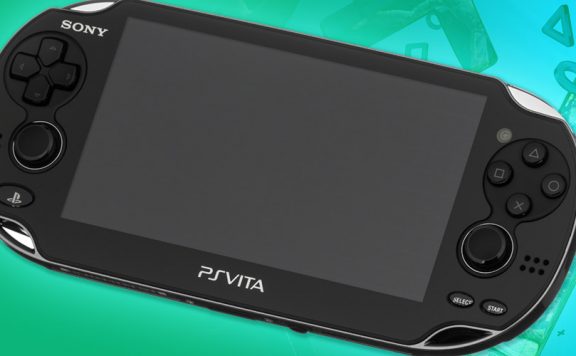
The PlayStation Vita has a native screen resolution of 960 pixels by 544 pixels. It displays those at a density of 220 pixels per inch. It’s a bright, vivid and well contrasted OLED display that is capable of looking astoundingly good, with the right content displayed on it. A shame, then, that so many of the platform’s big hitters don’t run at that resolution. Everybody’s Golf, Uncharted: Golden Abyss, ModNation Racers… the list goes on. And on.
The latest big name Vita title to run at a lower resolution than the menu screen is Resistance: Burning Skies, at least in our review code. Before everyone gets defensive about their beloved portable gaming device, let me say that I can live with a little image stretching if the gameplay is solid underneath. It’s not ideal, certainly, but I’ve played some ugly games in my time simply because I liked the way they played.
[drop]The issue here isn’t what I personally like, and don’t be arrogant enough to assume the issue is what you personally like, either. It’s about what is the best possible situation for us all. What is best for the machine, its owners and, perhaps most importantly at this point, its potential owners.Don’t let your love for that glossy black slab of tech cloud your judgement, games running below native resolution are less attractive in many ways than those that fill the full native pixel count. Stretching the image increases the “jaggies” that aren’t particularly well handled by the Vita’s anti-aliasing. It also gives the image a slightly blurred appearance that washes it out and robs it of some of the colour that the Vita’s luscious screen is so adept at displaying.
Top quality gameplay will lead us to forgive that, of course, but visuals are often the first thing prospective owners notice so hoping, asking, expecting better is wanting more people to be struck by what a great machine the Vita is. So, it’s something we can live with, but it’s definitely not ideal for a device that isn’t appealing to as broad an audience as it could be.
I would like to suggest that the Vita’s graphical prowess might have been overstated before its release. That famous, and completely erroneous, statement that the Vita is like a PS3 in your pocket raised our expectation levels to unreasonable heights. When my imported console arrived at the end of December, complete with Uncharted: Golden Abyss to play on it (it ended up costing me over £700, by the way – before anyone else suggests that I might “want Vita to fail”) I was eager to see how outstanding the visuals would be but I found myself feeling quite disappointed. I’d been hanging on to the impossible dream of PS3 quality visuals in my pocket and it wasn’t. It isn’t. It’s very impressive, for a portable device, but because I’d been told to expect more, I was disappointed.
The same mistake continues to be made. I’ve spotted a couple of outlets pretending that the “screenshots” of Resistance: Burning Skies that Sony sent around yesterday are really screenshots of the game on Vita. They’re not. They were sent through at a resolution 400 per cent larger than the Vita’s native resolution pixel count. They’re renders, probably pulled off the development machine (and stripped of any HUD elements, too) to show off what they’ve made, not what the Vita runs. This isn’t uncommon. For various reasons, certain outlets require larger images – decent quality print, for example – but usually the disparity in resolution isn’t so great.
[drop2]The review code for Resistance: Burning Skies won’t let the Vita’s standard screenshot function (pressing PS and START together) snap an image so we can’t show how it really looks but it does not look like those images. In short, Burning Skies is almost certainly not, as OPM.co.uk and others suggested, the “best looking game on Vita right now”.It looks fine, don’t worry about that. It’s perfectly fine. Quite good, even. Previews and trailers have told us that. What it doesn’t look like, is those images. OPM has the same review code that we do, I’m sure. So they know what it looks like. Even if they didn’t, as I didn’t when I posted the same images yesterday afternoon (I hadn’t loaded up the game yet), it’s fairly obvious from the size of the images and the lack of a HUD.
The cheeky question mark at the end of their hit-grabbing headline indicates that they know it’s a dumb question to begin with. At best this is a little bit disingenuous. At worst, it’s deliberately misleading and has the potential to part users from their hard earned cash for something which doesn’t look as they expected. I have ethical concerns over that but perhaps I’m just more sensitive than the guys writing for OPM.co.uk. Not that the post containing those screens is home to any writing – it’s just the full resolution images on a single page per image (pageviews are a valuable commodity for a website).
I have absolutely no issues with the – let’s call it “attention grabbing” – headline. I have no issue with the multiple pagination to grab a few more pageviews from each visitor. That’s the business and it’s probably why they’re better at it than we are. I am a little uncomfortable with the appearance that OPM.co.uk seems to be partaking in a kind of pretence about the images. Without explaining to visitors that these are not screens taken from a game that runs like that on a Vita, posting them under that headline is misleading. Isn’t it?
Maybe it doesn’t matter, and as I said, OPM.co.uk are certainly not the only people to do it. But I can’t help thinking that the first thought you have when you load the new Resistance game up for the first time should probably be something other than “oh, it doesn’t look as nice as I thought it would.” Especially when the way it does look is perfectly acceptable.

Jag
I’m disappointed by the lack of native res games especially when you look at Virtua Tennis.
I agree that the power of the Vita was way overhyped before launch but I kind of expected that a little after the original PSP “being a PS2 in your pocket”.
Resistance will be a good test if the Vita can do this gen gaming. From what I’ve seen it looks like there are small environments and not as many enemies to fight as in Resistance on PS3.
I hope I’m wrong as I’m really looking forward to it!
ultimatepunchrod
Really well written thoughts on this situation. I got really excited about Resistance after those screens released yesterday until I read some comments and realized that there was almost no way the game looks that good (it is Nihilistic after all). Even forgetting that though, it does raise unfair expectations for the game’s visual quality, so I hope I still enjoy it.
Tuffcub
Re: native resolution – how many PS3 (or Xbox games for that matter) run in 1080p?
As you were.
jeccross
No XBox360 ones do.
Thats the reason why few PS3 do either.
Forrest_01
But surely that should mean that all PS exclusive titles should run at 1080p right? Without the Xbox to hold them back?
Definitely not the case unfortunately.
colossalblue
not many but my PS3 and Xbox 360 – or my HDTV, I’m not sure – does a MUCH better job of handling the upscale than the Vita ever does when it has to upscale sub-native resolution. So there is still a solution needed, either native resolution at source or better upscaling on the VIta.
And there are native 1080p games on the Xbox 360, FIFA Street 3, all those years ago, was doing it. Not that it really matters on those machines, 720p is the sweet spot for this generation, neither console routinely handles 1080p competently for complex games.