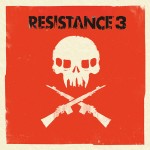
The EU Blog has just revealed the Resistance 3 box-art, and it’s gorgeous (and very non-gamey).
Mostly down to British graphic designer Olly Moss, who’s taken the traditional Resistance logo and theme and worked it into something completely unique and distinct.
As the Blog says, it’s not your typical ‘rendered hero’ art.


There’s a demo of the game coming on ‘specially marked’ Blu-ray copies of Battle: Los Angeles, which features the entire boat ride section of the game.
We’ve played Resistance 3 – it’s lovely, find out more here.
Origami Killer
i like it especially the teeth but i think its a big too bold, and poor colours, may stand out a bit too much
Origami Killer
*bit
Gadbury
I like the teeth too – didn’t notice at first that the gaps are skyscapers of New York.
Overall: very smart and an eye-catcher for sure.
Forrest_01
Nice touch!
Have to admit that i hadn’t noticed that until then, but its only because i hadn’t enlarged the pictures due to being in work. It’s quite noticable when blown up.
Bilbo_bobbins
looks a bit pap
Peter Rushton
Too red but otherwise a nice cover!
AG2297
I’m really quite neutral over it but I feel almost like it is a bit unfinished. And there is just something about the orange… I just get the feeling like it isnt quite finished and it just dosnt grab me. Makes me feel all neutral and blank.
Bilbo_bobbins
thats what I thought, no emotion from it, doesn’t make me want to grab the box and look at it personally.
wick15
Love that box-art. Nice to see something different and that also stands out well.
uuuhh
It’s a decent enough design, not keen on the colours though. Think the red should have been black, like the second image. Might look a bit too much like the venture bros season 1 dvd though.
It’s better than the cover for R2, but the one for Resistance 1 is still better.
Crocadillian
I think some peoples reactions are maybe more due to how different it is than it actually being bad. It’s so refreshing to see a different style of box art, considering how overused the current character pose format is. I think the box creates curiosity, and the red is sure to stand out from the browns and blacks that current game box art use ;3
enroene
couldn’t agree more.change is good.
enroene
nice cover.I think the cover makes me want to know more about it.Gives me the thought that it must be a killer.quite understated.goooood.
rht992
i can’t wait for the day i see this spray painted over something
rht992
it also means that logo will always make people think of the game. a nice clear simple image that can get stuch in your head. no words needed just that picture
BIGAL-1992
Looking good.