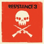
The EU Blog has just revealed the Resistance 3 box-art, and it’s gorgeous (and very non-gamey).
Mostly down to British graphic designer Olly Moss, who’s taken the traditional Resistance logo and theme and worked it into something completely unique and distinct.
As the Blog says, it’s not your typical ‘rendered hero’ art.


There’s a demo of the game coming on ‘specially marked’ Blu-ray copies of Battle: Los Angeles, which features the entire boat ride section of the game.
We’ve played Resistance 3 – it’s lovely, find out more here.
mynameisblair
Oh man, I really like that. So much better than the main character with a gun on the front.
gideon1451
Hear hear. Box art can be artistic, rather than having some generic grunt on the front.
Ben
Just stopped by to see this. I agree, it’s a fantastic design and a welcome change to the generic game box art on the shelves these days. I think this approach works well for a game like Resistance, they seem to mainly be targeting people who know what to expect from the game so there is no real need to display what the gameplay entails on the cover.
iamtdogg
yup agree totally, this is such an utterly sexy cover!
Jaffa-the-Cake
The only problem I have with this is that it wont match the other two game cases I have for R1 and R2. Why decide to change the theme all of a sudden?
Forrest_01
It wouldn’t match anyway due to the change in format of PS3 boxes (from spiderman 3 lettering down the side to the bold top border).
Besides, wasn’t the cover of FOM quite different to the cover of R2 anyway?
moshi
Slight bit of OCD there.
Jaffa-the-Cake
They were quite similar, not like this R3 one though. This is like Brink boxart, totally left field.
beeje13
errrr, I can see people having split opinions on this.
Personally, the design is actually cool but i don’t understand the colour scheme.
BLAGGER
Excellent work, reminds me of certain film posters from the 60’s – 70’s :)
Flash
What’s not to like!
Sympozium
Music does this too, its about time
JoshHood
Brilliant. Reminds me of the GAF Criterion Collection fan covers. So glad a developer finally did this.
billsmugs
It’s a shame they couldn’t go with the minimalist overlay that those GAF covers had; This box art is great but I can’t help but feel the bars at the top (particularly the blue one) detract from the design a bit.
Forrest_01
Trouble is that if it has move features, i believe they have to state it in the box.
The blue bars are on every move enabled product (that comes in a box) aren’t they?
billsmugs
I think they are always there, it’s just a shame they were originally designed that way, that’s all.
StevenHibs
Never judge a game by its cover ;)
ProjectJAY
This is a nice change of pace, I really like it :)
spooferbarnabas
Sorry but i don’t like it at all. Don’t get me wrong, i like how they’ve moved away from the traditional but that is just a bit too brash i think.
bunimomike
I can see what you mean but I think the brash/bold move is a clever one. It’s going to stand out like a motherfudger on the shelves in the high street and people who recognise the franchise will know that skull instantly. People who don’t will think “whoa… what the hell?” then go over to it and see what it’s all about.
spooferbarnabas
It may turn out to be clever, i’m not sure. Personally, i don’t see the relevance of orange to the resistance series and i think the side being blank will mean it often won’t stand out when stacked if you get what i mean.
bunimomike
Once again, agreed. We might find that all the warning signs in the game are these colours. If not, aye… be nice to know what relevance there is, if any! :-)
spooferbarnabas
Yeah, that would be good. I just hope the gameplay has changed since R2 because that, for me, seemed to go backwards from the original :)
Roynaldo
I dont like it either and quite the debate about it on twitter which ended up talking about the possible lack of Hale.
Still getting day one coz i loved the first 2, 2nd only to Killzone in the FPS stakes for me.